Daniëlle Cathari Just Reimagined Two of PUMA's Biggest Silhouettes
And we caught up with her to find out why.
For sportswear and footwear fans, Daniëlle Cathari is a name that needs no introduction. The designer is known for her feminine sportswear designs, plus major collaborations with the likes of adidas, Clarks Originals, Woolrich and, most recently, New Balance.
Now, she’s launching a brand new collection with PUMA, marking the first time she’s teamed up with the brand. Reimagining two of its signature silhouettes, the PUMA Suede and Speedcat, the result is playful and tactile, rooted in softness and classic Cathari colorways.
As the collaboration officially launches, we caught up with Cathari to find out more about how the team-up came about, the story behind the two new designs and her inspiration for the accompanying campaign.
Scroll through to read the full interview.

It’s your first-ever partnership with PUMA. How did it come about and why PUMA?
It just felt so natural. PUMA approached me about working on two of their most iconic silhouettes, and that immediately clicked. I’m always drawn to brands with a strong heritage, and I love giving my take on the brand’s most classic designs.
The collaboration features two of the brand’s biggest silhouettes, the Suede and the Speedcat. Which is your favorite and why?
I genuinely can’t choose. PUMA has such an authentic archive, and the Suede and Speedcat are such classic, nostalgic silhouettes, but both serve completely different moods. It felt like the perfect starting point of the partnership.
Can you tell us a bit about the process and inspiration behind your version of these silhouettes?
Because both silhouettes are so classic, I wanted to keep their original DNA intact — the suede material, the construction, and the nostalgic feel. My approach was to stay close to what makes them iconic, while giving them a fresh, very Cathari take on color and texture.

Texture seems to be a big focus for the design of your PUMA Suede. Why was that tactility important to explore?
With the Suede, it felt important not just to use the material but also to exaggerate its tactility and feel — the grain, the nap, the softness. Both colorways have a very subtle, worn-in look in their own way. The green colorway has a slight fade all over, with some spots in a brighter green and others washed out to a very light green, while the red colorway has a brushed, hairy feel, with the suede tips ending in white.
How would you say this collection differs from your previous footwear collaborations?
There’s a red thread throughout my footwear collabs — working with classics and looking for the space between familiarity and something new — that feeling of recognition mixed with reinterpretation. With this collaboration, I leaned even more into subtlety. It’s tonal but colorful, more texture-driven, and focused on preserving the purity of the silhouettes.
What can you tell us about the inspiration behind the campaign?
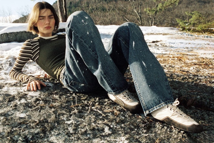
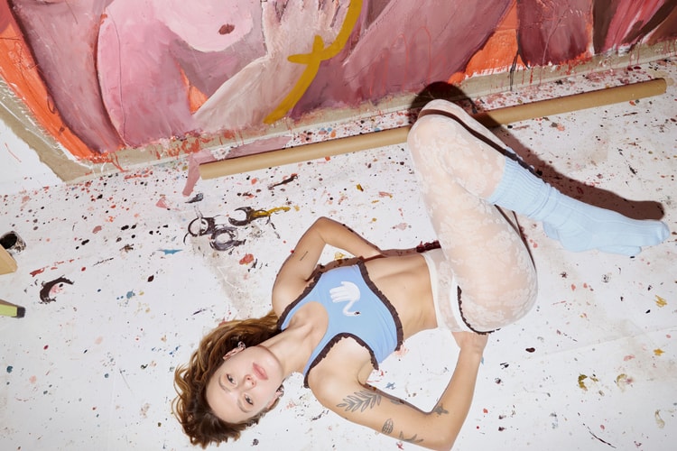
I wanted the campaign to feel soft, calm, and digestible — a mix of clean product shots, poetic moments such as a ladybug walking across the heel, and images where the model has small, subtle movements. Like an intimate, miniature universe around the shoes. Even with brighter colorways, the overall mood stays gentle and serene…

How do you see your relationship with PUMA evolving after this? Can we expect to see more collaborations in the future?
This first collaboration felt like the right introduction — focusing on iconic silhouettes and approaching them through color and texture in a very pure way. From here, the relationship will evolve into new directions… Yes, there’s more coming, and it will look very different from this one.
Finally, what else do you have coming up for 2026? Anything we should be keeping an eye out for?
More product, more PUMA, and a few new categories I’m really excited to explore. 2026 will be about expanding the CATHARI universe — more defined!


